WORK / Glacier Harvest
Ocean to Omega.
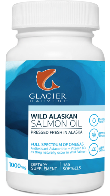
Silver Bay Seafoods sought to launch a new supplement brand to sell the high quality salmon oil it presses from fish harvested through its Alaskan fishing operations. In an already-crowded fish oil/Omega supplements market, it sought ways to build a brand carrying clear quality distinctions from competitors.


Given the relative lack of consumer knowledge about omegas and stand-out brands in the supplement category at the retail level, our research clearly pointed to SIMPLICITY – of narrative and design.
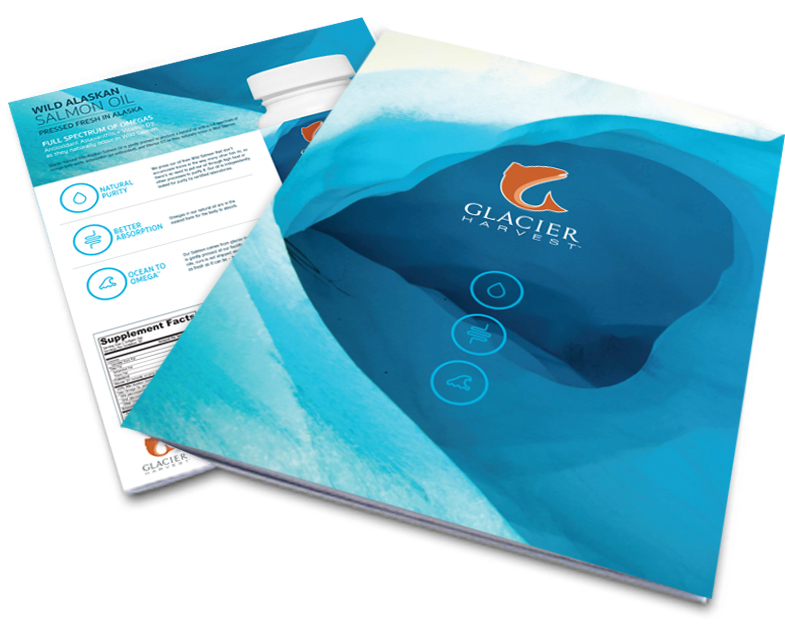
To do so, we studied the consumer understanding of fish oil/Omega supplements to find the right language, symbols, and imagery to communicate the product’s distinctive quality attributes. A key challenge was to clearly communicate rather complex technical concepts about the company’s unique salmon oil by distilling them down into consumer-approachable, bite-sized explanations, which aligned closely with notions of purity and sustainability.
Silver Bay's brand would be a new entrant in a mature growth market, so standing out on the shelf was critical for success. To begin, we created brand architecture, identifying the language and symbols key to ideas about cleanliness and purity.
All cascading brand elements emerged from our brand architecture and centered around the logo mark of a single salmon image. The clean, simple design of the jumping salmon visually creates a “G”, representing the name.
![]()
Purity. Absorption. Freshness.


