WORK / Baobest
The fruits of our labor.
When reviewing the performance and packaging for its Baobest BaoBites and Baobab Superfruit Powder, Baobab Foods came to us to increase the appeal of both products to different target consumers with cross-generational appeal.
Through deep intellectual capital from years of study consumer food culture, we uncovered the nuances of the Baobest story, identifying the various eating occasions in food culture for a variety of consumers, the context for those occasions, and the emotional landscape of how this product and brand could be expressed.
Looking at Baobab’s key customer base, ethnographic research was the primary methodology used to inform the design brief and ultimate execution of the packaging.
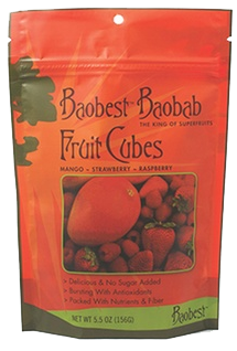
ORIGINAL DESIGN
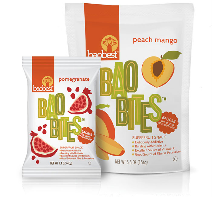
LABEL REDESIGN
Deliciously addictive.

The initial concept for the Baobites packaging design was to capture the symbolic value of a cross-cultural and indigenous product but in a contemporary style that resonates to the snack food experience in the U.S.
Because this was a redesign, our key goal was to simplify the design for a clean, but authentic look. The challenges were largely based on striking the balance of color and "pop" we were striving for with the quality of packaging texture and product visibility – while appealing to both adults and kids alike.
The completed design symbolizes some of the key brand elements of Baobest and who it is as a company: responsible, transparent, knowledgeable, proactive and innovative.
The brand’s visual identity also symbolizes some of the emotional benefits we want to communicate to the people who experience Baobest, such as empowerment and making an impact each day but in a spirit that is joyful, liberated...and a little wild.
